The Office of Technology Transitions’ (OTT) goal is to bring new, innovative, and reusable energy technology to the commercial market through funding and educational opportunities. Unfortunately, their mission and programs are lost in a bloated site that doesn't reflect the modern mission of the agency.
I worked with OTT leadership to make their site cleaner, clearer, and more useful to their target market. We also agreed to redesign the site using their Drupal theme's existing components, making it easier on developers and cheaper to make the changes.
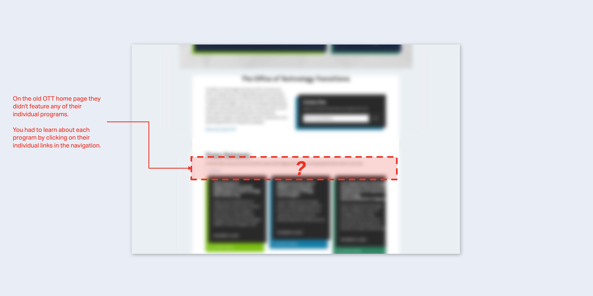
The Problem:The OTT home page and navigation is unorganized, bloated with unnecessary copy and components, and isn’t useful for both OTT employees and users interested in applying to their programs.
The Opportunity:OTT has an amazing portfolio of programs, services, and success stories that we can feature on the site and DOE has tons of existing sites where I can steal existing components to use in a site reskin.
The Solution:I leveraged the existing features in their Drupal theme to build a modern site that better describes the services OTT provides, who those services are for, and highlight when users can apply for these services.
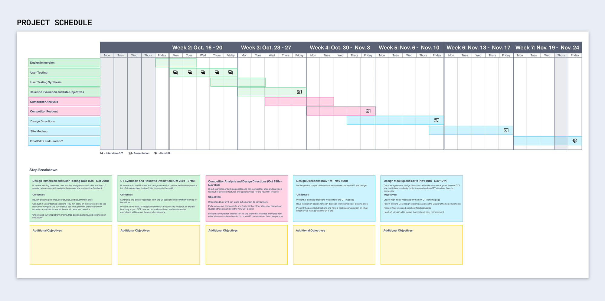
This project was a two month sprint and it was crucial that the client, developers, and I understood or objectives and had a clear plan of execution.
Using Invision, I made a interactive project schedule that we used to record final requirements for the project, benchmark deliverables, and mark down key meetings and deadlines. Everyone had access to this schedule and we often referenced it throughout the project.
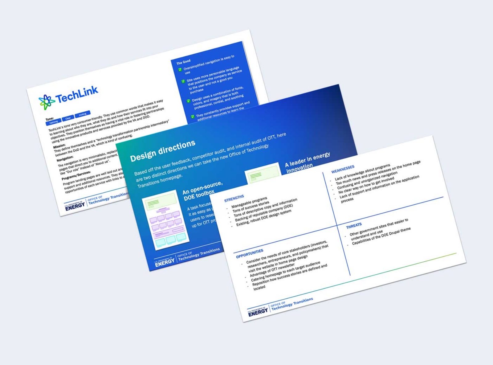
I interviewed numerous managers and staff at the Office of Technology Transitions to gauge their opinions of the current site and understand how it falls short of the goals of the non-profit.
I also did a deep dive into their competitors; understanding how they position themselves within the non-profit community and study interesting features that helped them differentiate themselves.
Armed with this information, I presented both competitor analysis and user testing feedback to the client and discussed how OTT can better position themselves.
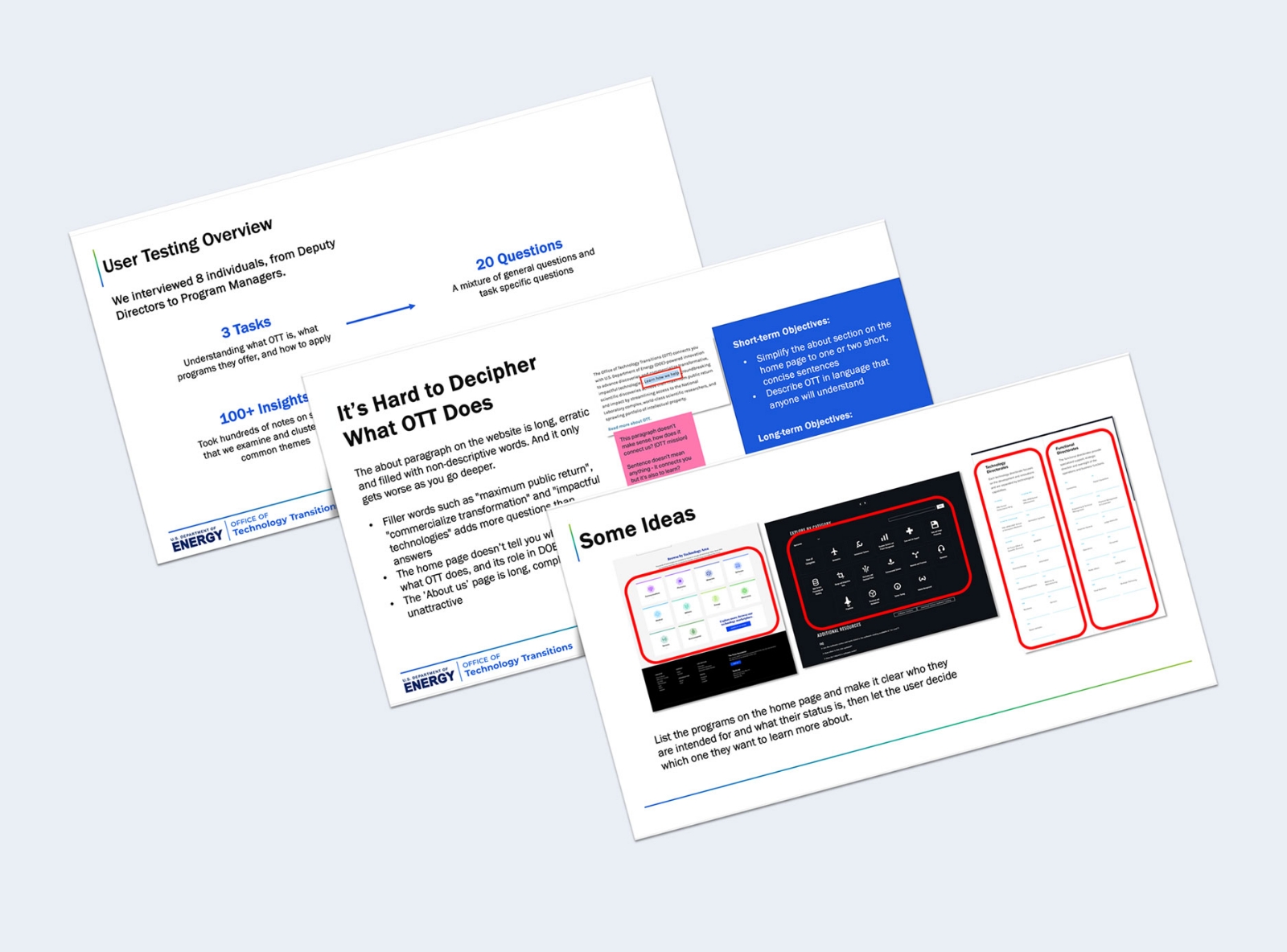
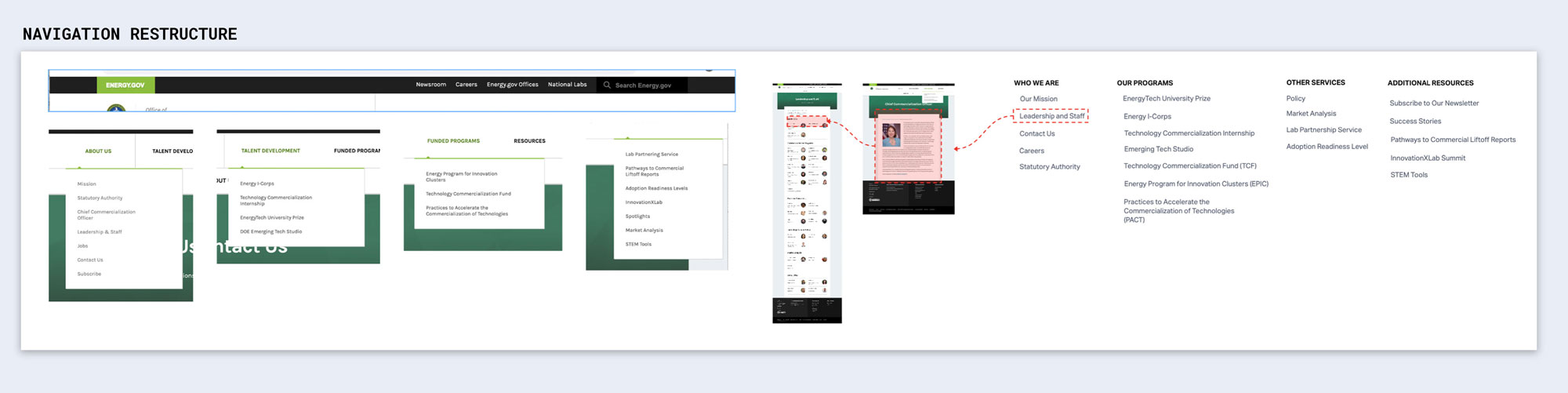
One of the first things I wanted to address was the poorly organized and labeled navigation.
Instead of splitting programs between two categories, I consolidated all OTT programs into one, simple "Our Programs" dropdown. I also added a section for additional, non-program specific tools and services that OTT provides. Lastly, I consolidated individual employee pages into a single "Staff and Leadership" page.
Because of its security features, Drupal has become the default content management system (CMS) for the US Government.
By combing through other OTT Drupal based sites and pulling the best components of each, I was able to build low-fidelity wires that addressed the needs of our client, aligned with the skills of our developers, and looked original and professional.
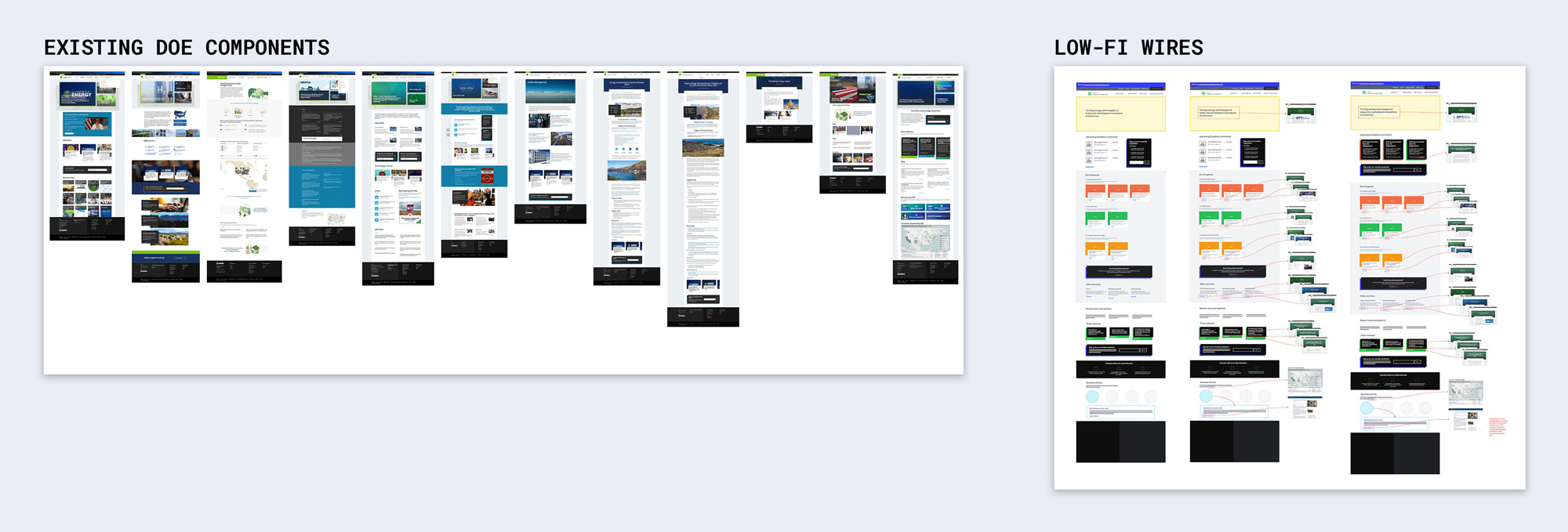
In my designs, I focused on cutting down content and simplifying complicated components. This shifted focus towards the programs and services that OTT provides.
I designed the wires in Adobe XD using existing features from other OTT sites. This ensured that the site designs were both professional and actionable.
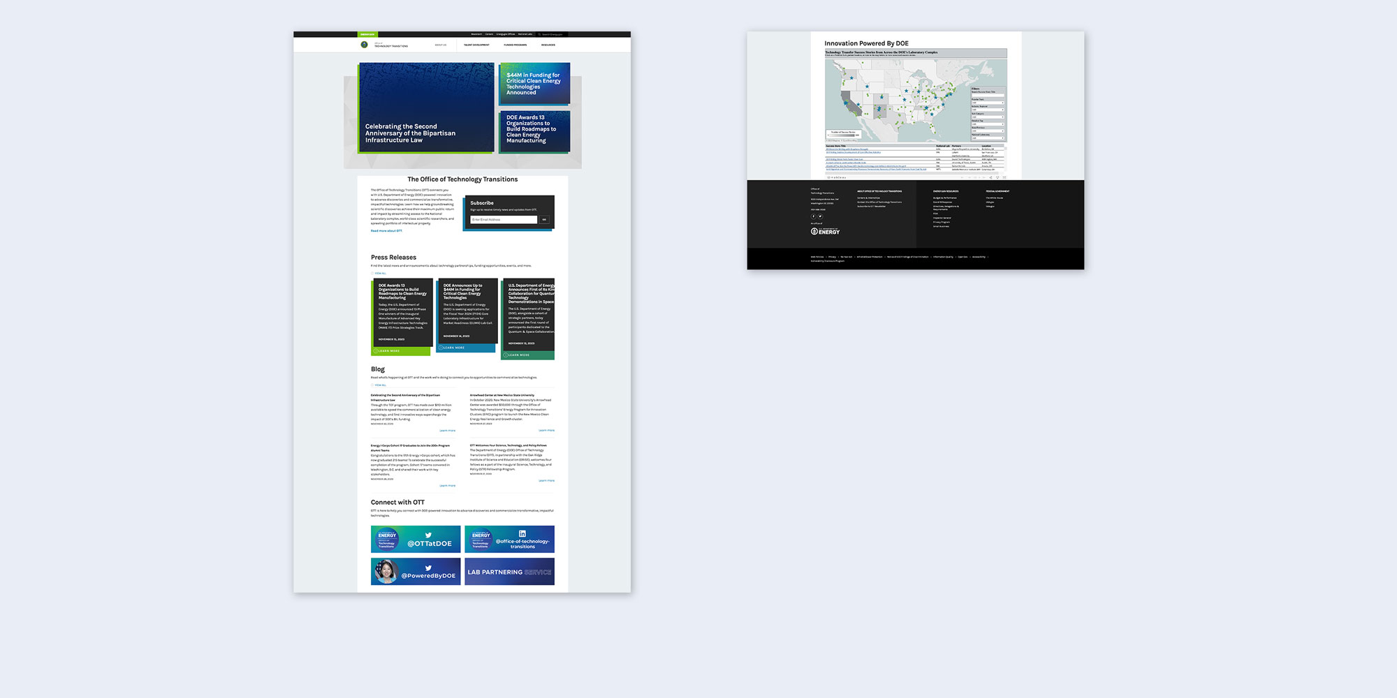
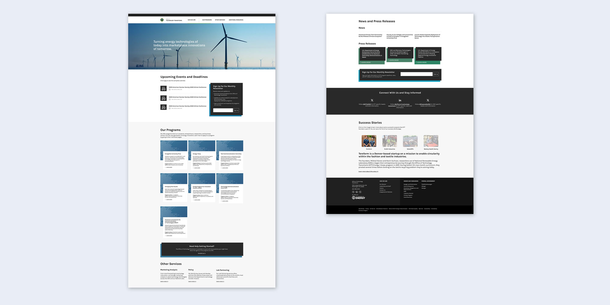
I replaced their old, post-based header with a full-width image overlayed by the OTT’s new tagline. Below that we have a calendar feed showing important dates and deadlines for OTT programs as well as a newsletter sign-up feature.
The top section now clearly states OTT's mission and provides easy ways to users to learn more about the agency.
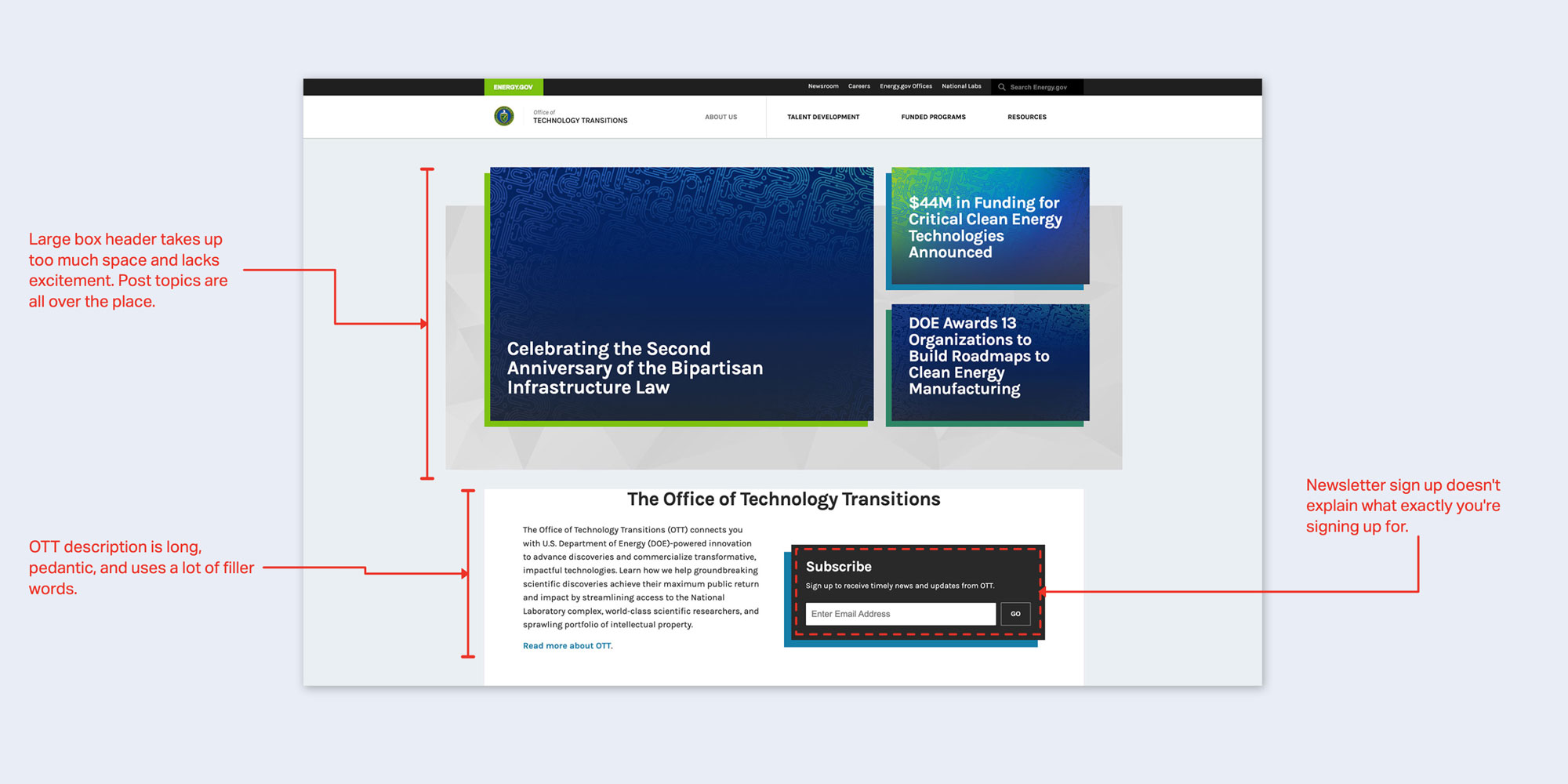

The main objective of OTT is to "promote the advancement and commercialization of energy technology by providing funding and research programs", so it makes since that we create a designated section on the home page for these programs and funding opportunities.
Each programs will have a short description, the status of the current program—whether it’s closed or open for enrollment—and who can benefit from applying, Programs will also use the same image background, cutting down on cognitive load and allowing users o easily determine which programs are right for them.

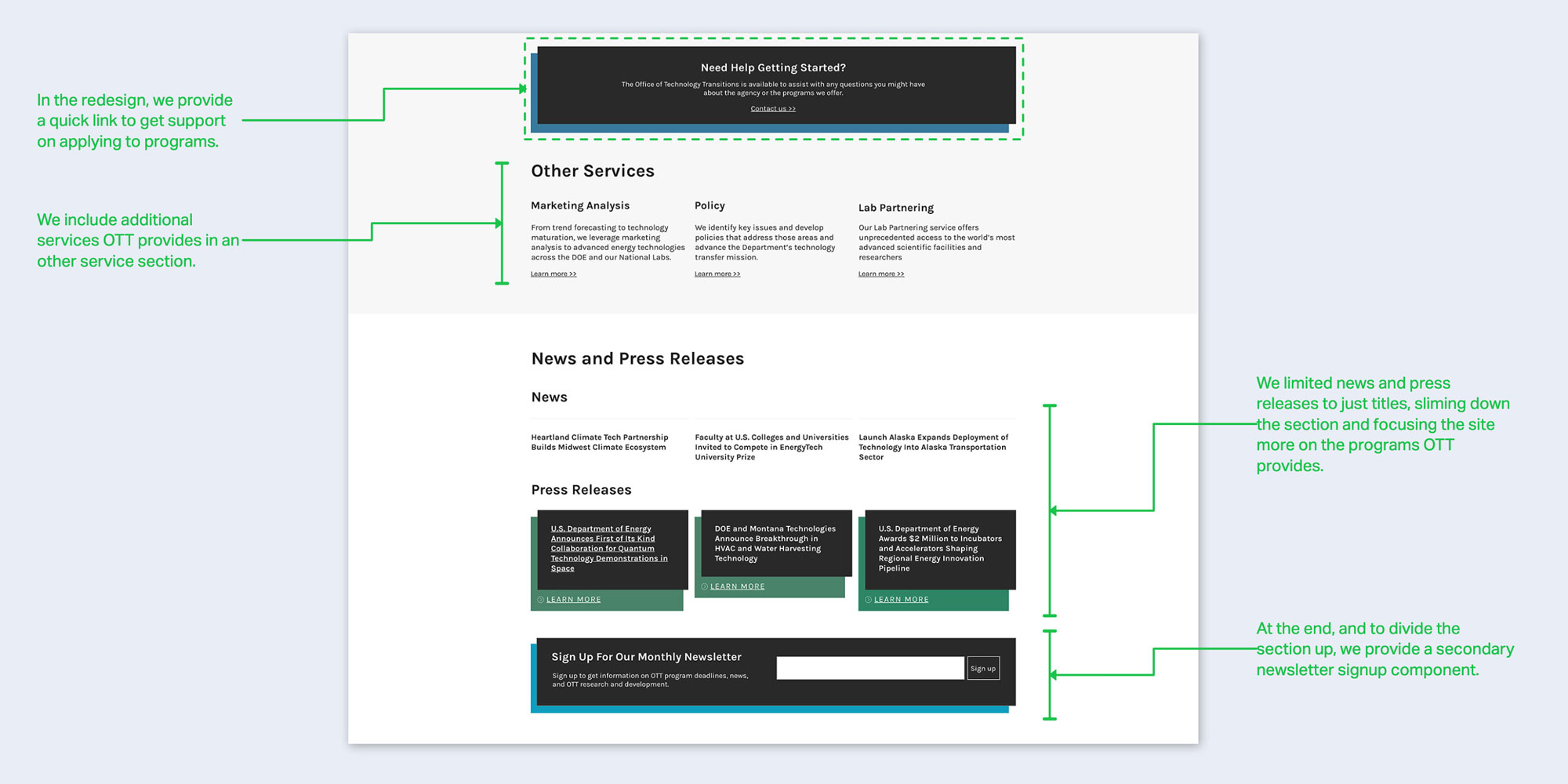
OTT doesn’t just offer programs; they offer marketing and policy analysis as well as access to National Lab directories. While these services aren't used as often as their programs, they are extremely usefuland warranted designing a unique space for them on the landing page of OTT.
Beneath that is a small section for any recent news and press releases.

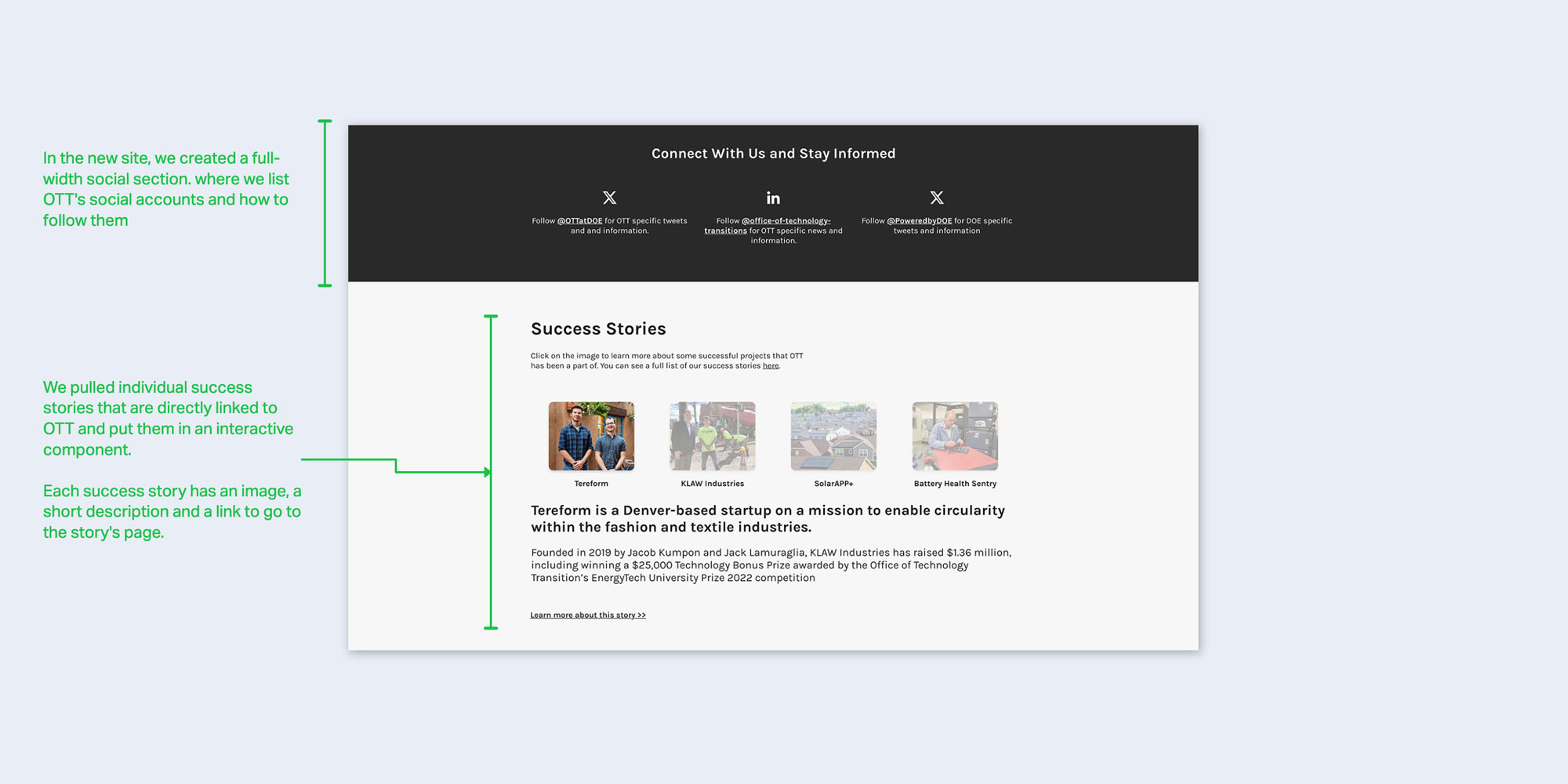
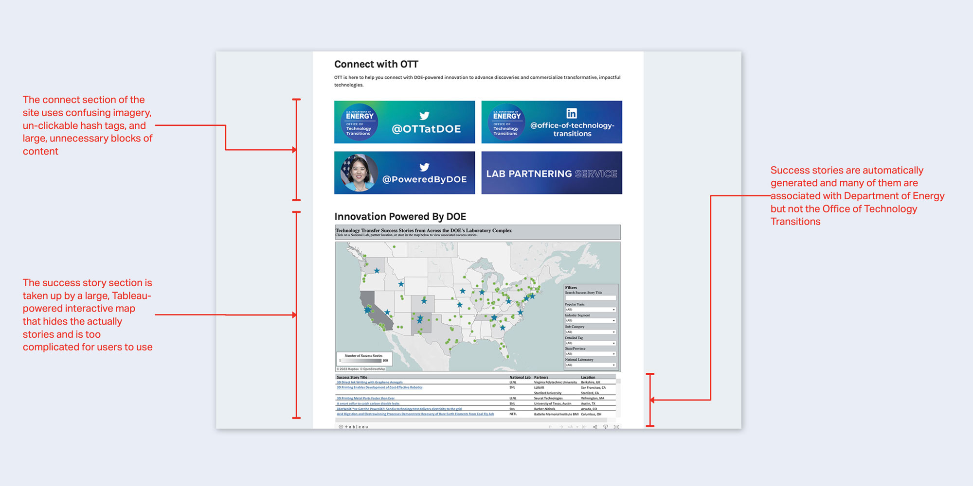
I replaced the old and oddly designed 'Connect with Us' section with a more straightforward design, focusing on each OTT social media account and their respected tags.
I also replaced the convoluted, Tableau generated success map with four simple success stories made possible by the OTT.
While this two month sprint was only for the home page, this project has the potential to become a lager digital overhaul for the entire Office of Technology Transitions digital presence.
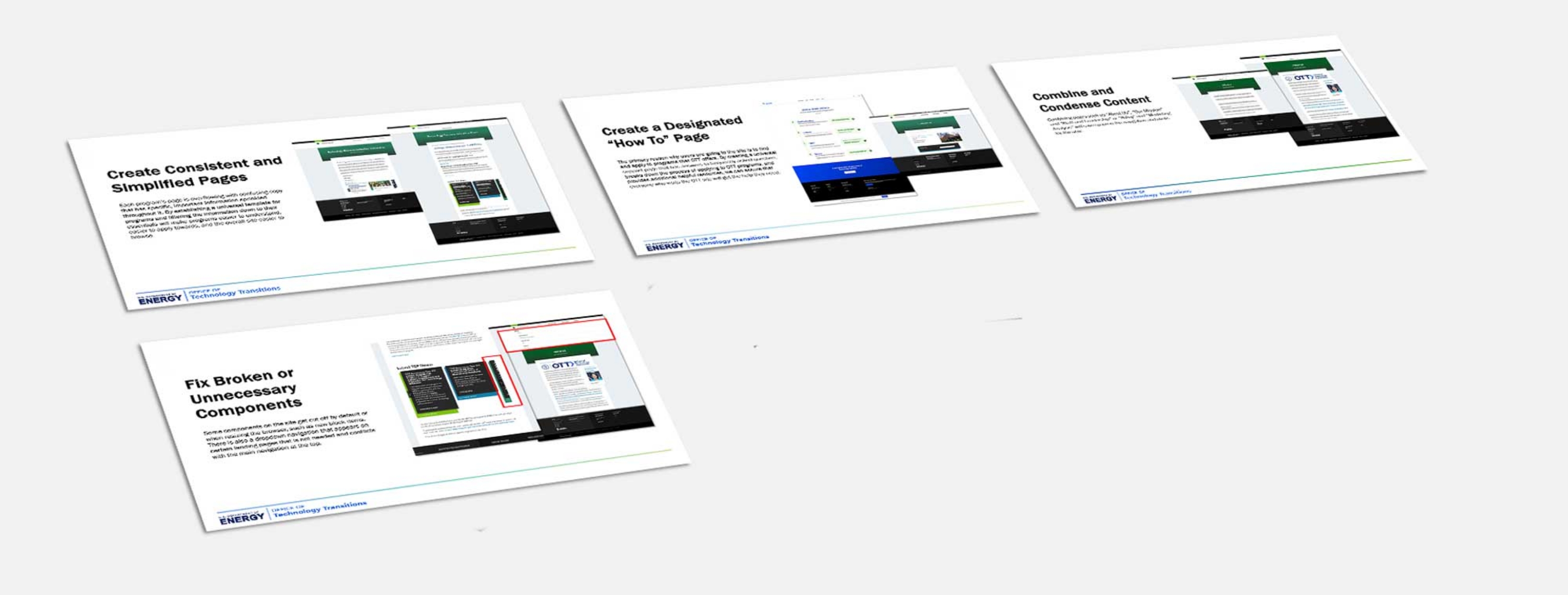
After handing the final wires off, I provided a half-dozen suggestions for larger improvements to the OTT site, including improving the individual program pages, providing better support for users signing up for programs, and removing superfluous components from pages.