Building Bridges partnered with Fjord to reimagine their brand identity. Their goal: create a brand that not only embodies their mission but also inspires donors to continue investing in non-profit programs that support families across Washington, D.C.’s 7th and 8th wards.
The Problem:Building Bridges Across the River’s brand was outdated and didn’t reflect both the quality of its programs and the professionalism of its volunteers.
The Opportunity: Washington’s 7th and 8th wards are unique—defined by rich history, tight-knit community, and remarkable resilience in the face of gentrification.
The Solution:Craft a brand message and visual identity rooted in Anacostia’s greatest strength–its community.
Over six months, we immersed ourselves in the community—hosting workshops, interviewing staff and volunteers, and visiting the Smithsonian’s Anacostia Community Museum. For over six months our team held workshops, interviewed staff and volunteers and visited the Smithsonian's Anacostia Community Museum.
Through our research we gained a better understanding of the deep-rooted issues impacting Anacostia and the cultural significance of Building Bridge and its strong ties to the neighborhood it serves.
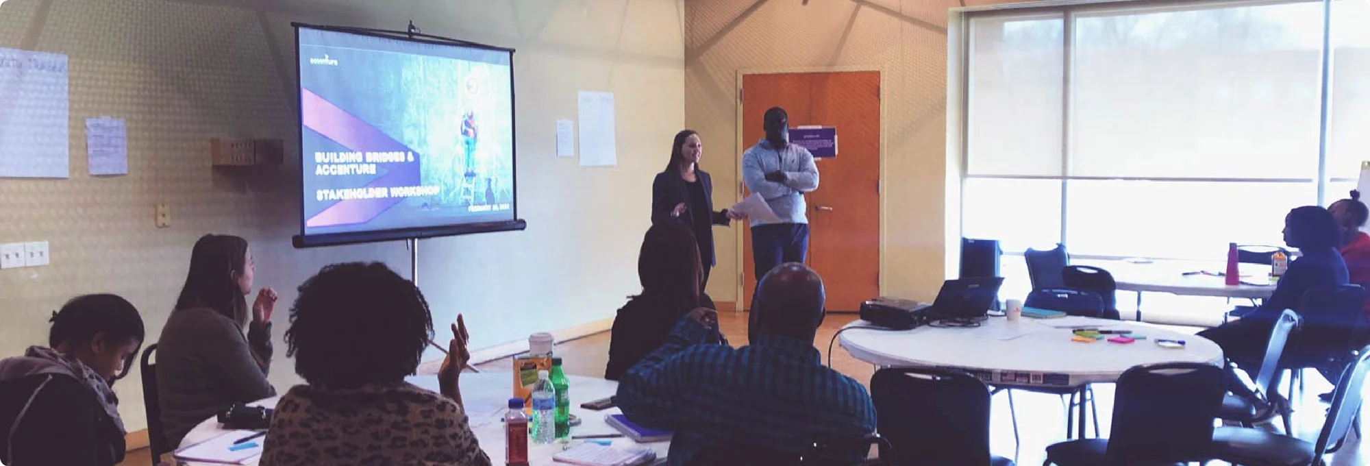
Our research revealed a clear truth: living in Anacostia comes with a deep sense of resilience and pride. These same traits drive Building Bridges’ mission of bringing community members together to create meaningful change.
With that insight, we built a brand positioning centered on one idea—what’s possible when people come together.
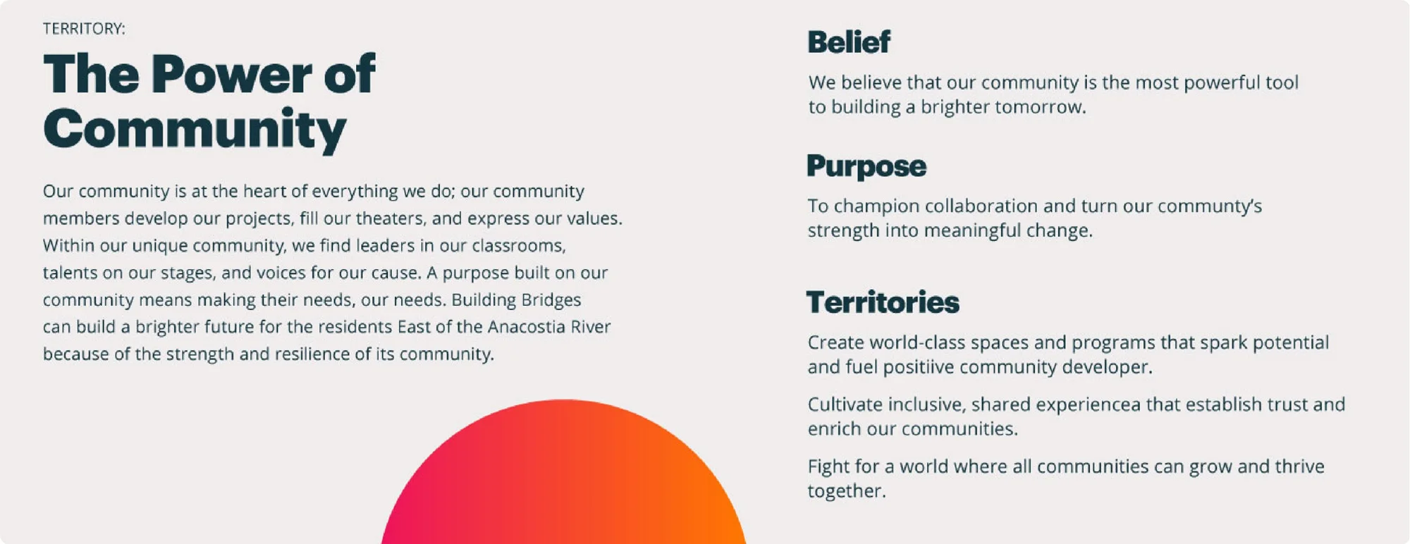
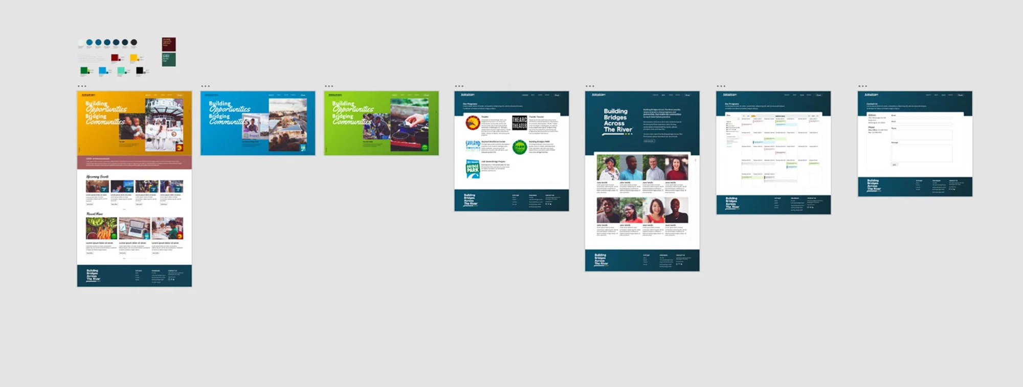
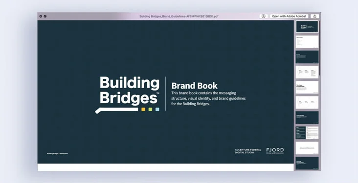
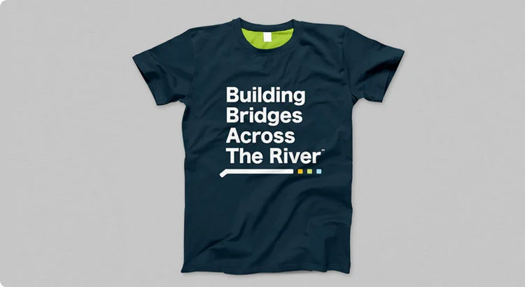
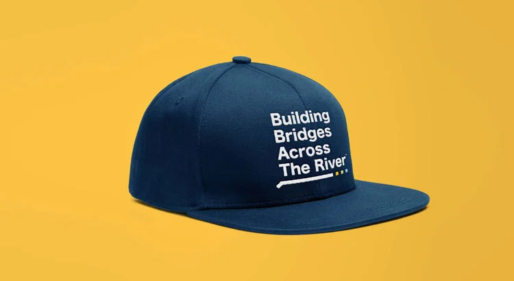
We designed a brand identity that was visually strong yet flexible. We wanted it to be distinct on its own, but never overshadowing Building Bridges’ child organizations.
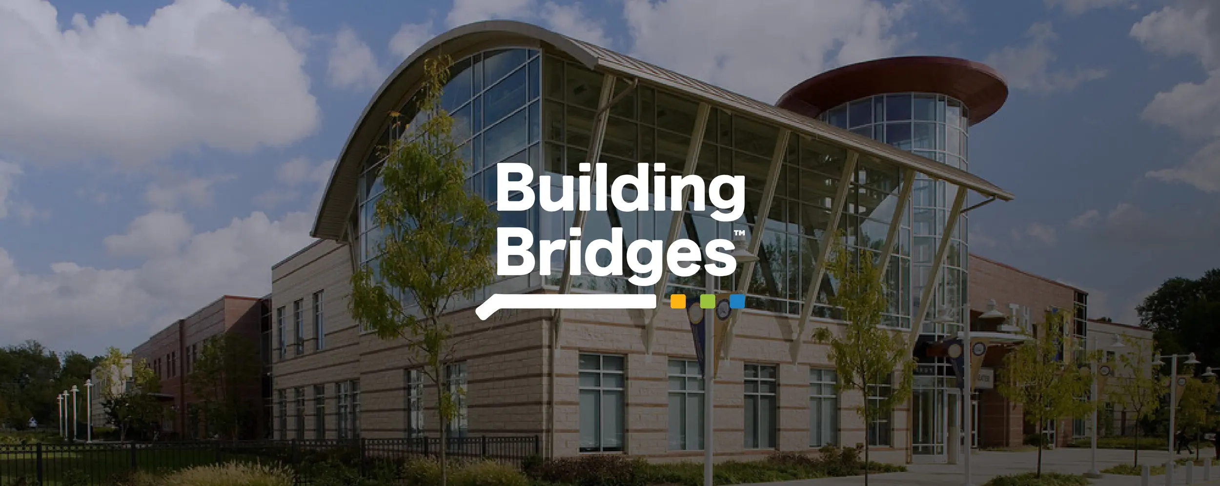
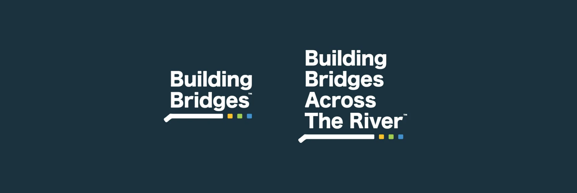
We decided to focus on a text heavy logo supported with a simple bridge icon. The logo is anchored through a color palette pulled from Building Bridges' child organizations.

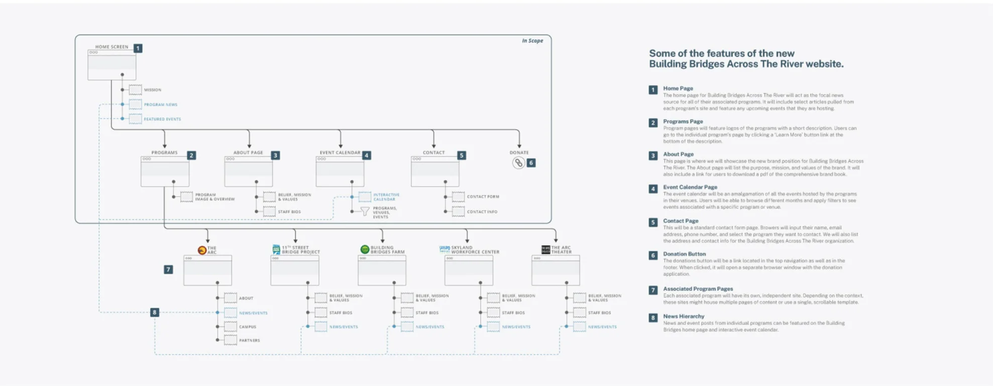
We wanted the Building Brdiges site to act as the organization does; a hub for community organizations and those that benefit from them.
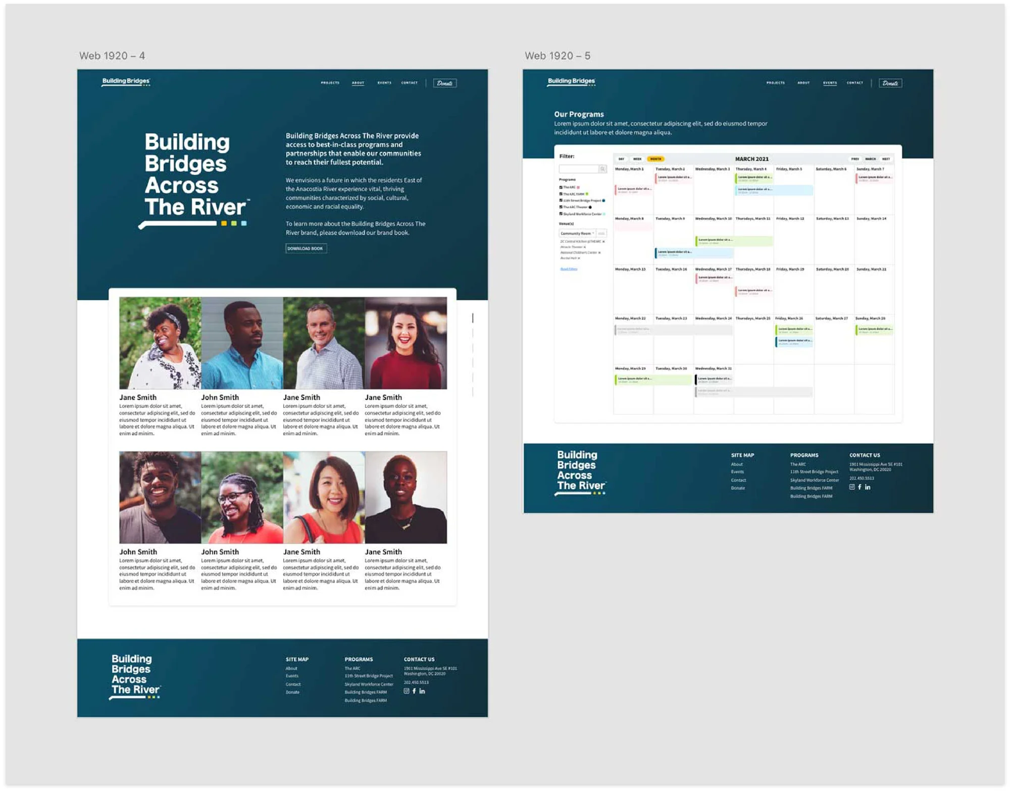
The site brings all their programs under one roof, featuring updates, stories, and resources, as well as a calendar that will act as a digital bulletin board; constantly updaitng with new events and activities.
The result is a platform that’s not only a tool for Building Bridges but also a valuable resource for the broader Anacostia community.
